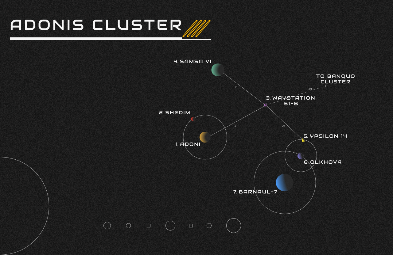
Mothership Tabletop UI Case Study
(if you’re here for a good time but not a long time, here’s a link to the final prototype)
Last year I finally got the Mothership Tabletop RPG to the table. For those unfamiliar, Mothership is a Role-Playing Game that thrusts players into the most inhospitable environment in the universe and pushes them to consider what they would compromise if they could only choose one of the following outcomes: save, solve, survive. Will you give your last breath to save a teammate? Will you fire off a warning transmission as you accept your fate of the omens you’ve uncovered? Or will you leave more unfortunate souls to deal with horror as you jettison off to safety? It is survival horror with weighty ultimatums. Nom nom nom nom nom, so juicy.
While I could wax poetic about how much I love that game, I also found myself spending every morning considering how I might immerse my table a little more, provide visual cues for more cohesive story telling, and help to ground the setting a little more when 6 people are trying to imagine the same scene in a world they have never seen before. TRPGs are collaborative story telling, improv, and imagination to the core. Finding that anchor point for everyone to latch on to can be difficult and can lead to wild fever dreams of imagination at best, or disconnected players who can’t find the story because they can envision themselves there.
So, the objective in front of me was: Provide an immersive and interactive tool for visual storytelling to help players and Wardens (the person creating the scenario and conflict for the players) easily anchor themselves in the setting.
Audience & Immersion Challenges
In tabletop RPGs (TRPGs), gameplay is shaped by two distinct roles: the Game Master (GM)—or in this case, The Warden—who defines the scenario and conflicts, and the players, who control individual characters navigating the world. While these groups have different responsibilities, they share a common goal: deep, immersive storytelling.
The Limits of Traditional Immersion
Immersion in TRPGs has historically been influenced by the medium’s wargaming roots. Physical elements—such as terrain and miniatures—help create a sense of space and scale, making it easier for players to visualize the battlefield. However, these tools focus primarily on combat encounters, reinforcing the idea that when a visual aid is introduced, a fight is about to happen.
Outside of combat, immersion relies almost entirely on spoken storytelling. GMs describe environments, characters, and actions, while players respond based on their understanding of the world. To bridge gaps in visualization, GMs often supplement their narration with maps, handouts, and props. These tools help establish a shared world but require manual effort to prepare, and their effectiveness depends on how well they align with the players’ mental image. Without strong visual anchors, players may feel disconnected, placing more narrative burden on the GM.
Opportunity: Enhancing Visual Storytelling
During the concept phase of my design, I focused on enhancing visual storytelling to support both GMs and players. I explored the idea of an interactive UI that functions like a “live feed” of what characters see, providing a more immersive way to experience the world. Unlike traditional props, this would offer real-time visual engagement while still allowing players to interpret and interact with the story naturally.
As I researched existing solutions, I realized that while digital tools for TRPGs exist, none fully integrate dynamic visual storytelling in a way that complements the freeform nature of roleplaying. This gap presented an opportunity to create a new kind of immersion aid—one that balances the strengths of traditional narration with the advantages of interactive visuals.
Design and Iteration
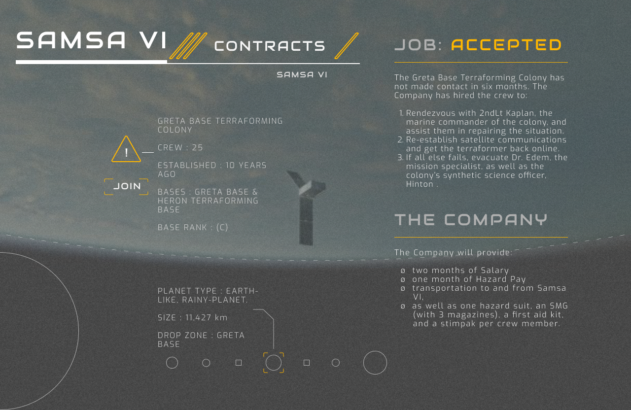
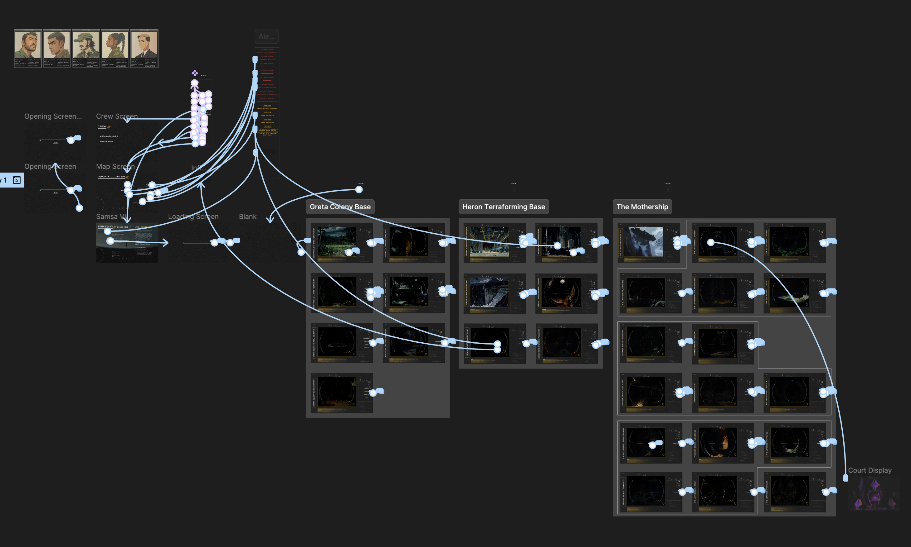
I gave myself just over two weeks to build an MVP. It was bare-bones—essentially a glorified PowerPoint with images for players, plus simple navigation to reference screens for NPCs, objectives, etc. It was… fine. But it allowed me to gather player feedback on what was helpful, fun, distracting, or unnecessary. More importantly, it showed me how to improve the backend experience for the Warden so I could be more responsive to player choices.
With each iteration, I introduced more dynamic navigation. Agency is key in TRPGs—players need to feel like they can go anywhere and do anything. By adding a location menu, players could make choices, and the UI would seamlessly respond, reinforcing immersion by making their decisions feel impactful.
Another major feature was the Rules Carousel. Understanding the rules directly affects a player’s ability to engage, strategize, and have fun. Flipping through a handbook mid-game kills immersion—or worse, makes players hesitate instead of acting on instinct. Inspired by loading screens in video games, I added a chyron that passively cycled through core rules. This way, players absorbed mechanics naturally without needing to pull out the rulebook.
Lessons from Experimentation
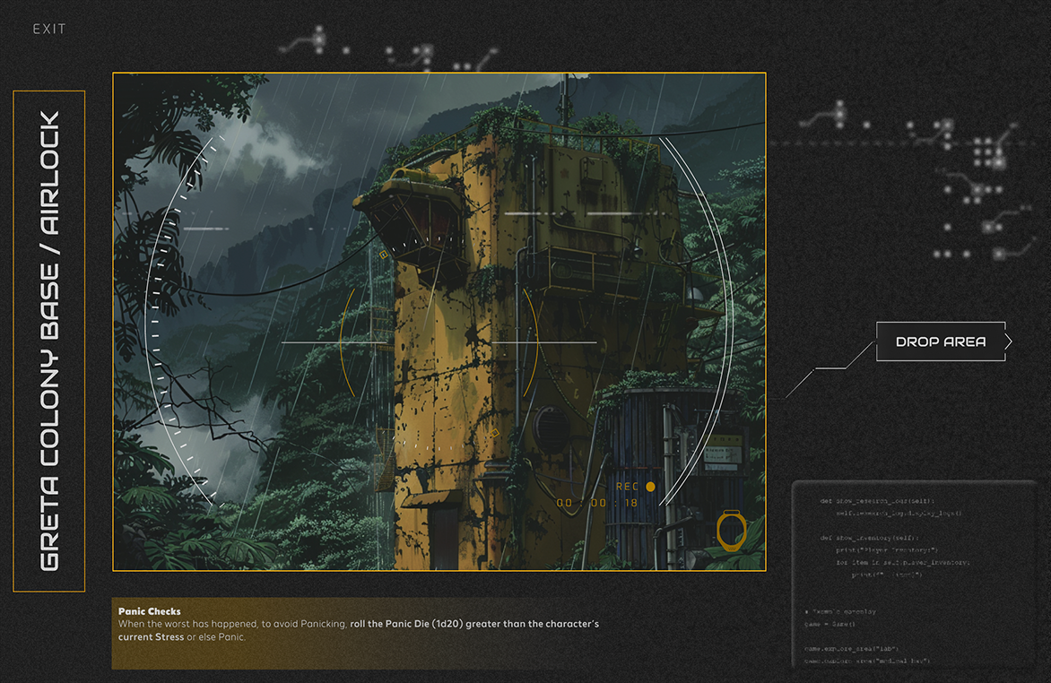
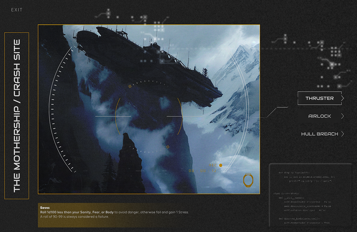
For one iteration, I went hard on the idea of a “video feed” UI, drawing from first-person shooters (FPS). I added a looping VHS-tracking effect, static overlays, animated HUD elements—basically, full sci-fi horror mode. It looked cool. It felt immersive. But it was also a mess.
In playtests, I found myself constantly disabling the VHS animation. The viewfinder UI became noise, blocking useful information without adding real engagement. The biggest lesson? Just because you can, doesn’t mean you should.
At the end of that game, I felt proud of what I had built. Players were deeply engaged. One even asked for the file to run his own game. And that’s when it hit me—I had designed this entirely with the players in mind but had completely neglected the Warden’s experience. When I looked at my design file through fresh eyes, it was a labyrinth. What made perfect sense to me was an unintuitive mess for someone else. If this was going to be usable beyond my own table, I had to rebuild.
The Final Solution
I set myself a challenge: streamline everything. I cut ruthlessly—both in terms of what was on-screen and how the backend was structured. The goal? Make it so simple that anyone with zero Figma experience could hit “Play” and run the game without friction.
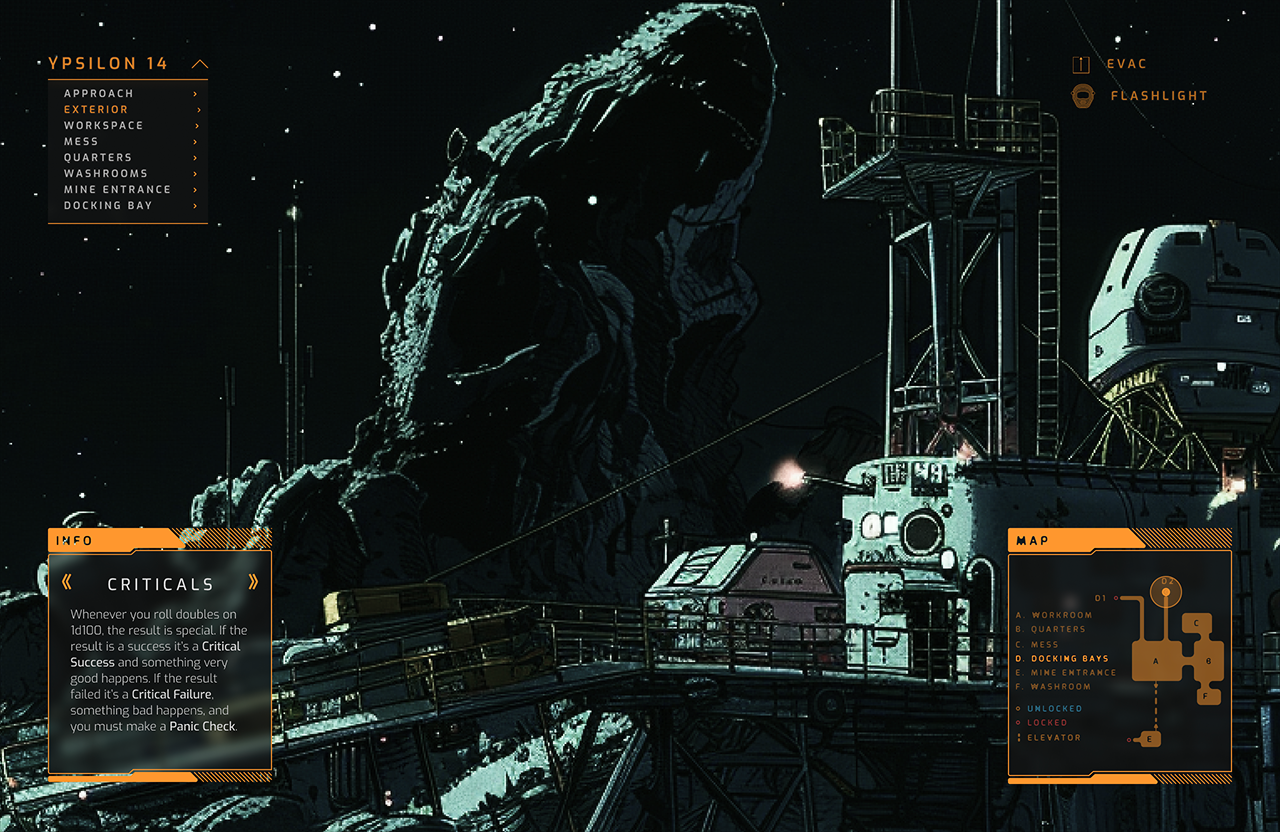
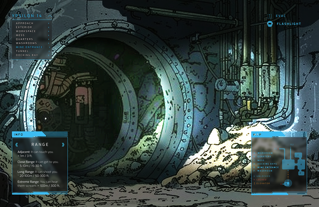
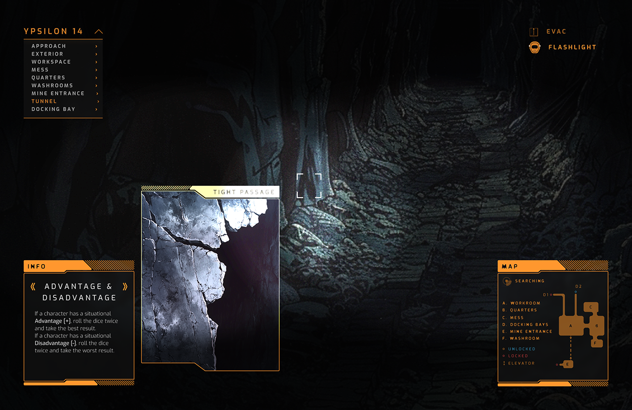
I compressed the main loop into just two main screens: the main location UI and a loading screen.
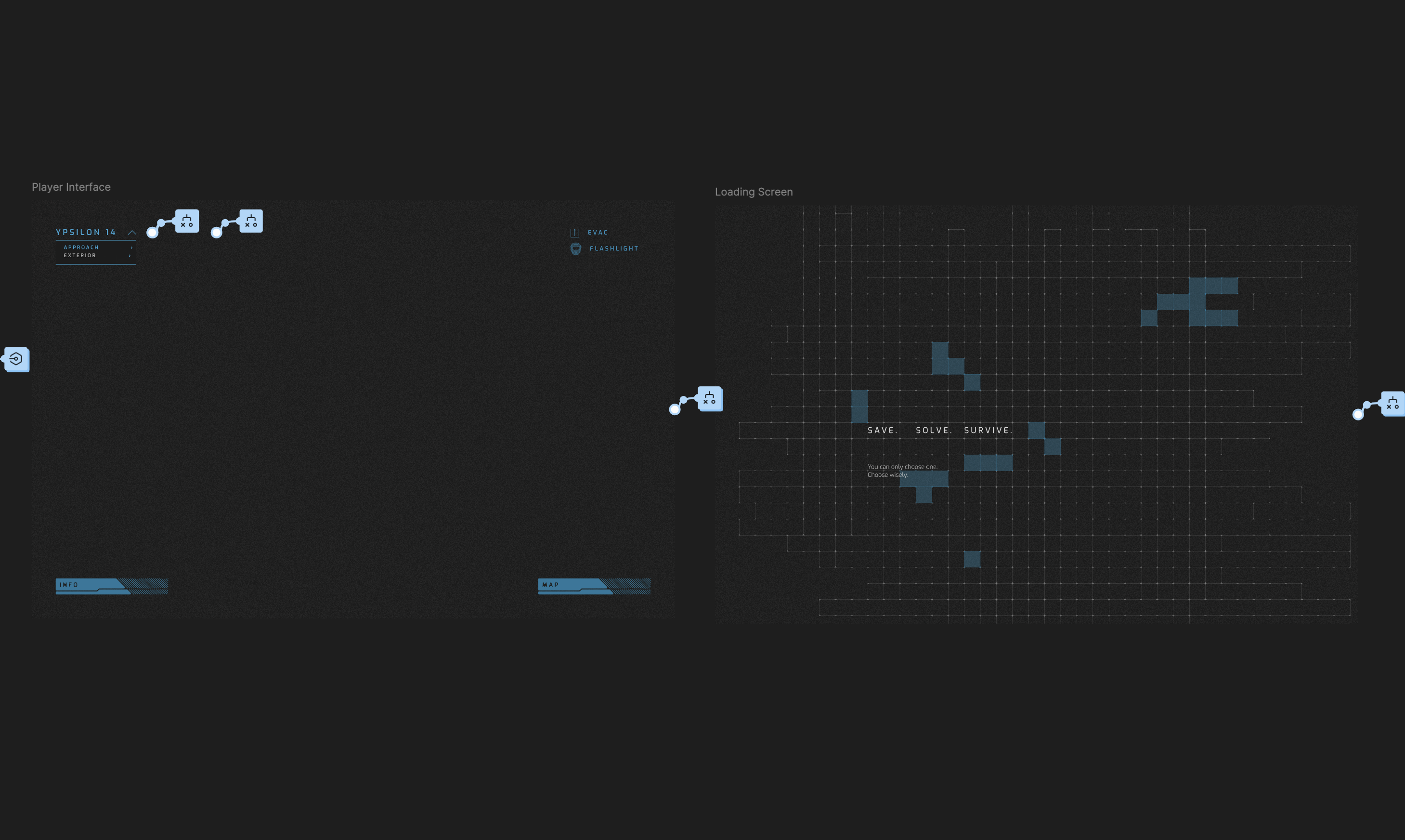
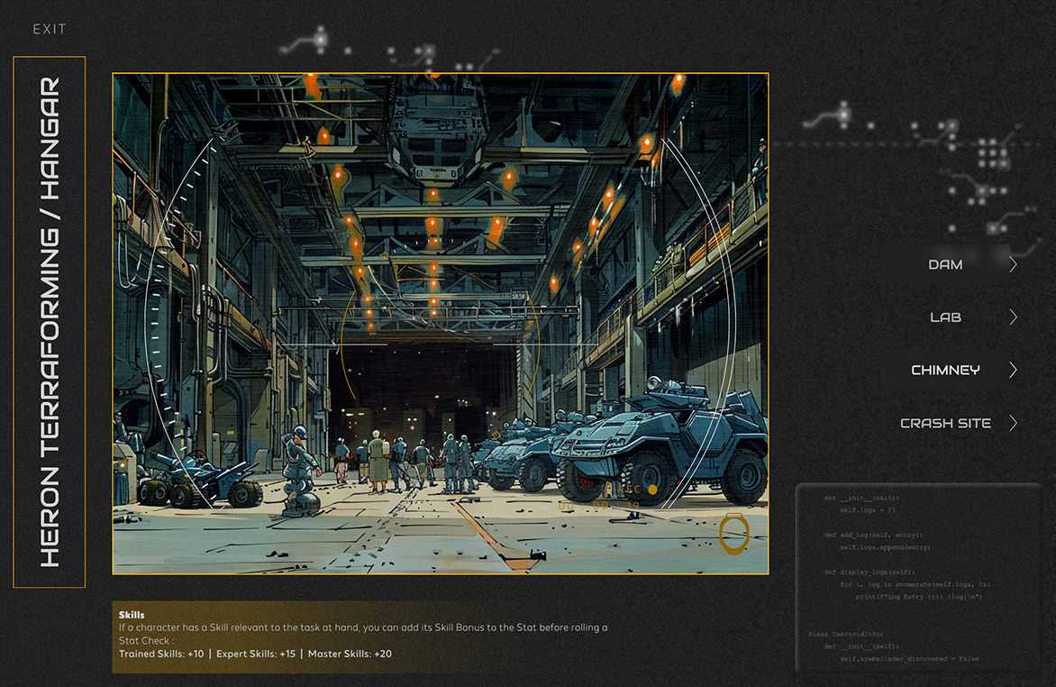
- The location image now takes up the full screen, with controls overlaid like an FPS HUD.
- The Rules Carousel, Map, and Location Menu became collapsible, reducing visual clutter.
- All moving elements were scrapped—too distracting. But I made the screen scrollable so it gave the illusion that the players were looking around.
- Conditional logic powered most transitions, cutting down on unnecessary screens.
- Drawing again from experience with video games, I added a loading screen to smooth transitions, giving the illusion of background processing while actually just making the UI shift less jarring.
This move was a game-changer. By automating transitions and leaning into Figma’s prototyping logic, the Warden could focus on storytelling rather than wrestling with a clunky interface. The UI did its job—supporting the game without stealing focus. Figuring out this sleight-of-hand trick was one of my proudest moments.
Results
Since completing the UI, I’ve tested it with different groups both in-person and online via Discord. Each time, players are initially surprised to have an interactive tool like this at their fingertips. They’re eager to explore—clicking around and engaging with everything on screen, which is exactly what I hoped for. But once the game begins, they settle in, fully immersed. The UI elements act as visual anchors, helping them imagine their characters’ interactions and expand the world beyond what’s displayed.
Reflections
While I’m thrilled with how this project turned out, I see room for growth. Future iterations could refine the Warden UI further, improving its accessibility and expanding features to accommodate more complex scenarios. Additionally, adapting this concept into a standalone tool—rather than a Figma prototype—could open doors to broader adoption. I’m excited to explore how this could evolve into a polished product for the TRPG community.
Depersona Font Abstract
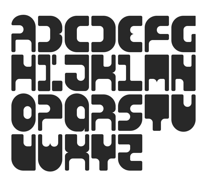
This typeface was designed specifically for use within the game supplement, CyBod ReDesign Maching. The setting for the game is cyberpunk in theme, and CySigma Corp represents the antagonist entity in the game. The original concept of the monospaced type was created by taking a fixed 2x3 ratio mat and removing or negating areas using smaller 2x3 masks, oriented as needed to create the negative space for each letter. However, as the design progressed, the function was needed to balance conceptual form, and concessions were made to result in the final product.
I approached this by being very hard-lined with how I used the masks to form each letter; having a strict ratio for how and when I would keep a corner or round it, where masks would be placed on vertical and horizontal axises to create continuity and interesting negative space. The first departure came when I realized that letters like B, K, R, and X were more difficult to distinguish. I borrowed from the cleavage that the E, M, and W all shared and added that cleavage to integral intersections of strokes in B, K, R, and X.
The most difficult design challenge was the “I”. The first draft had the “I” at half width with half rounded corners. While it was the most distinguishable, it broke the pattern for a true monospace font. After over 20 iterations, I was left with two: one that utilized serifs to fill the needed space, and one that utilized distortion. When I was designing this, a constant theme that kept nagging me was the “removal of self” that the CySigma Corp would be pushing onto their customers. But more to how it relates to this font, the “removal of ‘I’”. The resulting design is the only glyph that is broken into multiple segments. As a little cheeky plus, when turned on its side it simultaneously looks like a prominent figure handing something to a lesser figure and a frowny emoji.
All design and layout work was done in Figma and Photoshop.
Designed and published in 2024.
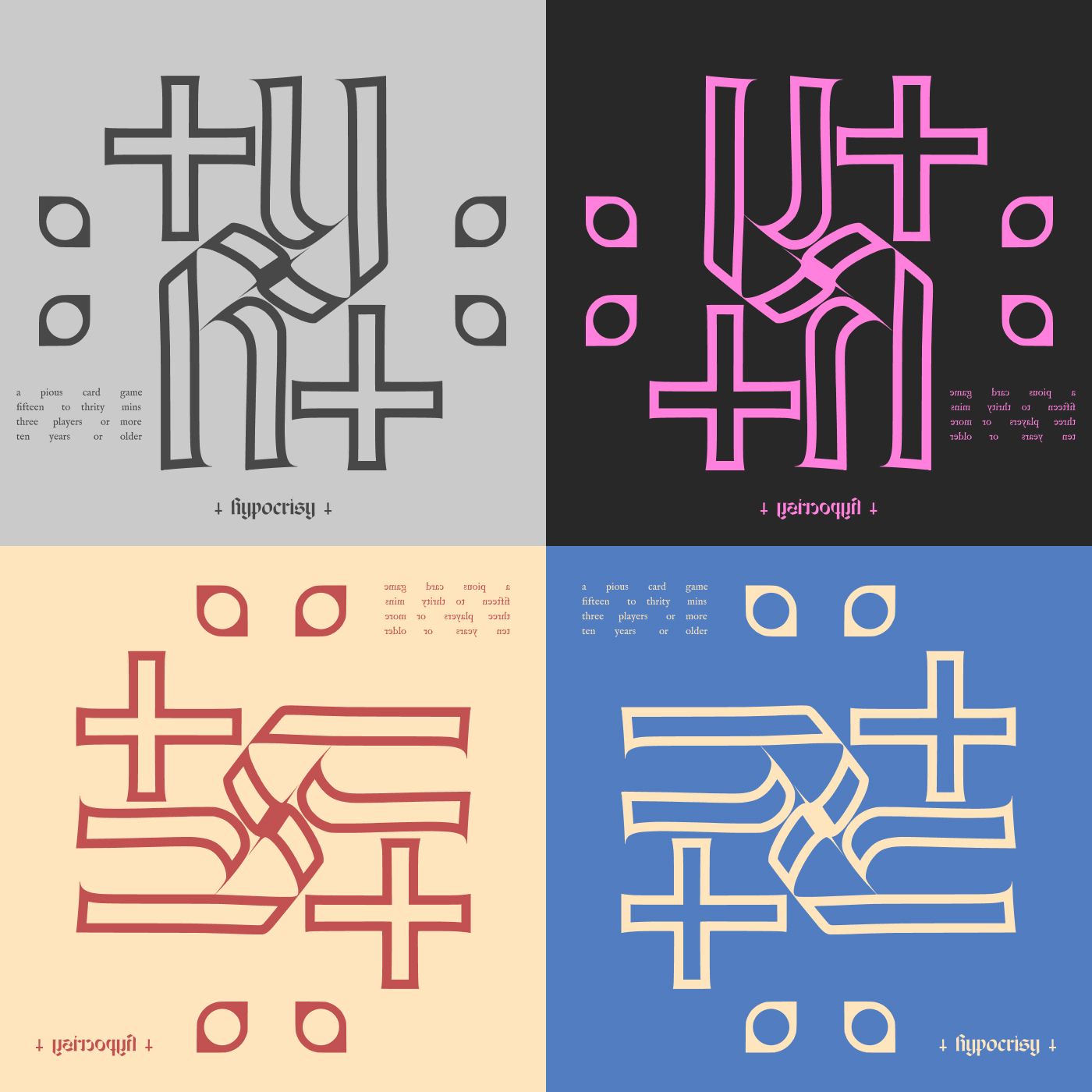
Hypocrisy Abstract
This is a card game built around a standard deck of playing cards, jokers included. The game design came from a question of if there could be a novel concept to a standard deck of cards. The game theme and graphic design was inspired by 80s horror films, hymnals, and older books on exorcism rites. Players begin the game as Priests who have taken a vow of silence as penitence for the demons they’ve been unable to release. Skilled as they are in the exorcism of others, they are blind to effectively address the shadows that darken their mind. Together, they must work to exorcize all their demons and discover a path to purity. If they lapse in focus or briefly question their faith, and they may be lost to the Legion within them…
The game is played by dealing the deck of cards to each player. Players then hold their cards facing the other players so they are unable to see the cards in their own hands. Players must rely on others to help them deal with the cards in their hand, hoping that there does not come a time where they must blindly try to play a card from their own hand.
The idea for a trifold was born from design trends that are happening in the indie TTRPG space. I wanted to provide a unique way to have a substantial amount of information concisely organized, and designed compactly to fit inside a standard deck of cards; the instructions have the dimensions of a standard poker card when folded.
All design and layout work was done in Figma.
Designed and playtested in 2023.
Published in 2024.
What is The Wards of Ursting
Wards is set in the fictional city of Ursting during the Victorian Era. Think Gangs of New York, but without all the nationalist and racist undertones. In the game, players will take on the role of a Faction leader, vying for control of the 4 wards of Ursting. Strategy, influence, and a little bit of luck will be necessary tools to master to gain control of the Wards.
Fiction aside, in this game, players will be rolling dice and playing cards to ensure that they have the greatest total value over their opponents. The object will be to collect as many dice as you can and knock your opponent out of the game. Wards is a “Roll High, Take-That” on its face that has enough strategy to give players chewy decisions, but has just enough swing to always give the underdog a fighting chance. Let’s dive into what makes this game tick.
Design
This project was an exercise in constraint. We had 3 goals that we set out to meet as we were designing Wards:
The game must be simple but have depth.
The components needed to be common enough that someone might already own them or could be easily and cheaply purchased.
The rules must fit on a single sheet of paper.
The initial concept: each player has a set of polyhedral dice that they wager and roll against each other, hoping to have the greatest total value to gain all the dice wagered; the player who collects all the dice wins. Simple enough. We imagined that the sets of dice were warring armies, and you, their fearless commander. You decide what units to send into battle, recruiting if necessary but realizing that the more you risk the more you lose. This was interesting for about 10 minutes. We knew that the concept was simple, but taking it from that to something that had depth was going to be a challenge.
Everyone has an old deck of cards laying around, so that seemed a natural fit for our design. We went through a number of different ideas on how to incorporate cards into the game. Maybe we should have a market of a few cards, and you can pay for them with dice in your control? Or maybe instead of simply paying for the card with a die, a player might roll a die and hope to roll higher than the value on the card to be able to purchase it? Once a player has cards, what do they do with them? Should we create a reference sheet, so each card in a standard deck could be related to an ability that can be used when the card is played?… On and on we went trying to find the right answer. We wanted to make it simple, we didn’t want there to be extensive referencing, and we wanted the abstraction of the cards and dice to make sense working together both mechanically and in the fiction of the game.
The single sheet of paper constraint was probably the best thing that we could have done for designing. Games are notorious for being contrived and complex for the sake of showing the number of mechanics that the designers can string together, for the likeness they hold to a style of video game that they want to recreate on the table, or simply because they want to account for every conceivable scenario. Those attributes were enticing if not sometimes sneaky with how easy it was to just make a rule for everything, and before long we had a document that was 6 pages long. This was necessary because it led to some of the most challenging, but ultimately rewarding, design problems that we had to solve. Cut after cut, distilling down to the essence, we found that we were able to say what we needed with as much flavor as we wanted and keep it approachable to play with some friends in a pub. If it wasn’t clear before, just because it could be done doesn’t mean it should. Holding true
to our original goals defined the constraints that made Wards as tight, punchy, and quick a game as we could have hoped.
Theme
Eventually, we let go of the idea of players commanding warring armies as that felt a little too grandiose for what we were working with. We shifted gears and found a lot of inspiration both in theme and mechanics when we imagined this as a turf war fought by gangs in a Victorian setting. This opened us up to understand how cards could work and juicy tactical decisions that so easily married mechanics to the setting and theme. One of the first applications of this was with the creation of the “Influence Deck”.
The Wards of Ursting plays like a battle royal, as players try to gain as many of their opponents dice as possible by rolling the highest value in The Fray. Everyone loves to roll grips of dice, but dice are more or less random chance and the basic concept didn’t lend itself to any substantial strategy. The idea that seemed to stick in our head was the idea of the cards being used to manipulate the dice, either by forcing a reroll or by changing the value of a die. Calling the cards Influence just seemed like a logical jump, because you aren’t always certain that exerting Influence will result in how you intend. The theme also lends itself to the mechanic for how a player would gain Influence throughout the game. Picture this — a fight is about to break out and a faction leader sends one of the rank in file to go bribe the authorities to stay out of the way or to get some dirt that could be used when the time is right. The officer could oblige and provide some desired
information, or they could turn on the factions and conduct a Sting on the faction safehouse and round up some of the more roughed members, using the distraction of the Skirmish to hit when the Crew is disposed of.
Swing in the game
The first thing that we needed to solve was the swingy-ness of dice. Just rolling dice back and forth didn’t really provide a lot of opportunity for strategy because players just look at the size of the dice being rolled and weigh their chances according to that probability. As stated before, this got old real quick. So we decided to use cards to represent Influence, giving players the ability to actually manipulate the game state after the dice have been rolled. Giving players the option to draw cards as part of their Scheme phase opened the door to some juicy decisions: Do you Recruit multiple dice into The Fray to intimidate your opponents and improve your chances of winning the next Skirmish? Or, do you reduce your strength in the Skirmish phase to Fix and draw a card, improving your arsenal of Influence you can exercise as you will? This decision really started to show us the dials we had to turn up the tactics and strategic thinking, giving players a little more control
of their fate that otherwise could have been just a roll of the dice.
Structure
Rounds are structured through each phase; each player having the ability to make and respond to decisions. We didn’t use a turn structure at first, giving players the ability to choose when or if they play a card in response to the result in the Skirmish phase. This led to confusion, missed opportunity, and excessively long turns where players were trying to hold out as long as they could — not preferable when you want the game to create tension through decisive play rather than it be an awkward result of indecision of the players. This also gives players the ability to respond strategically as the battle unfolds in front of them rather than making gut decisions for fear of missing an opportunity.
Elimination
We wanted to be sure that all players are engaged the whole time - even when they have lost everything. Being eliminated from a game sucks; especially if it was quick. It is very possible in Wards for players to be eliminated quick. We wanted this game to be punchy and sharp. In a 2-player, head-to-head, battle, that’s what you want. Quick games that you can run back and try new strategies with relatively quick and decisive feedback. But with larger player counts, we wanted players to have the ability to turn the tables even when they had run out of dice. So, this is how we solved for that: when a player runs out of dice in a 3 or 4 player game, they are considered Busted. In the fiction, the leader of their faction is taken into custody. But while they may not have their Crew, they do have their wits and their ability to gain Influence from people that are in the clink with them. When they are Busted, they keep all the Influence cards in their hand, and draw one extra
from the deck if possible. This keeps them engaged, giving them just enough opportunity to break something out of prison and possibly gain another Crew to get back in the game.
I think this will wrap my first dive into the game. More to come I’m sure.

**