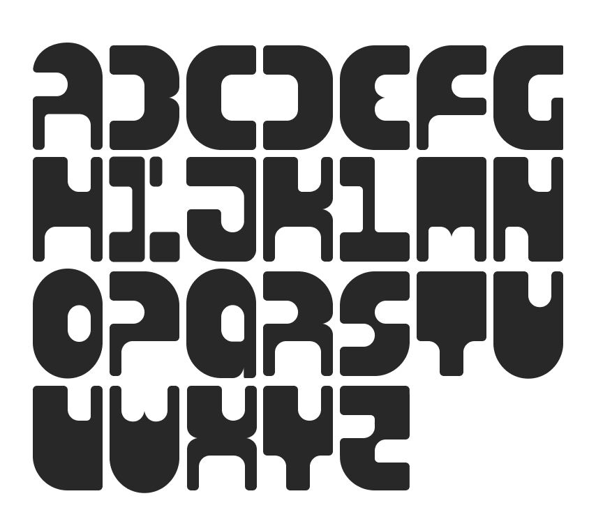
Depersona Font Abstract
This typeface was designed specifically for use within the game supplement, CyBod ReDesign Maching. The setting for the game is cyberpunk in theme, and CySigma Corp represents the antagonist entity in the game. The original concept of the monospaced type was created by taking a fixed 2x3 ratio mat and removing or negating areas using smaller 2x3 masks, oriented as needed to create the negative space for each letter. However, as the design progressed, the function was needed to balance conceptual form, and concessions were made to result in the final product.
I approached this by being very hard-lined with how I used the masks to form each letter; having a strict ratio for how and when I would keep a corner or round it, where masks would be placed on vertical and horizontal axises to create continuity and interesting negative space. The first departure came when I realized that letters like B, K, R, and X were more difficult to distinguish. I borrowed from the cleavage that the E, M, and W all shared and added that cleavage to integral intersections of strokes in B, K, R, and X.
The most difficult design challenge was the “I”. The first draft had the “I” at half width with half rounded corners. While it was the most distinguishable, it broke the pattern for a true monospace font. After over 20 iterations, I was left with two: one that utilized serifs to fill the needed space, and one that utilized distortion. When I was designing this, a constant theme that kept nagging me was the “removal of self” that the CySigma Corp would be pushing onto their customers. But more to how it relates to this font, the “removal of ‘I’”. The resulting design is the only glyph that is broken into multiple segments. As a little cheeky plus, when turned on its side it simultaneously looks like a prominent figure handing something to a lesser figure and a frowny emoji.
All design and layout work was done in Figma and Photoshop.
Designed and published in 2024.
