Mothership Tabletop UI Case Study
(if you’re here for a good time but not a long time, here’s a link to the final prototype)
Last year I finally got the Mothership Tabletop RPG to the table. For those unfamiliar, Mothership is a Role-Playing Game that thrusts players into the most inhospitable environment in the universe and pushes them to consider what they would compromise if they could only choose one of the following outcomes: save, solve, survive. Will you give your last breath to save a teammate? Will you fire off a warning transmission as you accept your fate of the omens you’ve uncovered? Or will you leave more unfortunate souls to deal with horror as you jettison off to safety? It is survival horror with weighty ultimatums. Nom nom nom nom nom, so juicy.
While I could wax poetic about how much I love that game, I also found myself spending every morning considering how I might immerse my table a little more, provide visual cues for more cohesive story telling, and help to ground the setting a little more when 6 people are trying to imagine the same scene in a world they have never seen before. TRPGs are collaborative story telling, improv, and imagination to the core. Finding that anchor point for everyone to latch on to can be difficult and can lead to wild fever dreams of imagination at best, or disconnected players who can’t find the story because they can envision themselves there.
So, the objective in front of me was: Provide an immersive and interactive tool for visual storytelling to help players and Wardens (the person creating the scenario and conflict for the players) easily anchor themselves in the setting.
Audience & Immersion Challenges
In tabletop RPGs (TRPGs), gameplay is shaped by two distinct roles: the Game Master (GM)—or in this case, The Warden—who defines the scenario and conflicts, and the players, who control individual characters navigating the world. While these groups have different responsibilities, they share a common goal: deep, immersive storytelling.
The Limits of Traditional Immersion
Immersion in TRPGs has historically been influenced by the medium’s wargaming roots. Physical elements—such as terrain and miniatures—help create a sense of space and scale, making it easier for players to visualize the battlefield. However, these tools focus primarily on combat encounters, reinforcing the idea that when a visual aid is introduced, a fight is about to happen.
Outside of combat, immersion relies almost entirely on spoken storytelling. GMs describe environments, characters, and actions, while players respond based on their understanding of the world. To bridge gaps in visualization, GMs often supplement their narration with maps, handouts, and props. These tools help establish a shared world but require manual effort to prepare, and their effectiveness depends on how well they align with the players’ mental image. Without strong visual anchors, players may feel disconnected, placing more narrative burden on the GM.
Opportunity: Enhancing Visual Storytelling
During the concept phase of my design, I focused on enhancing visual storytelling to support both GMs and players. I explored the idea of an interactive UI that functions like a “live feed” of what characters see, providing a more immersive way to experience the world. Unlike traditional props, this would offer real-time visual engagement while still allowing players to interpret and interact with the story naturally.
As I researched existing solutions, I realized that while digital tools for TRPGs exist, none fully integrate dynamic visual storytelling in a way that complements the freeform nature of roleplaying. This gap presented an opportunity to create a new kind of immersion aid—one that balances the strengths of traditional narration with the advantages of interactive visuals.
Design and Iteration
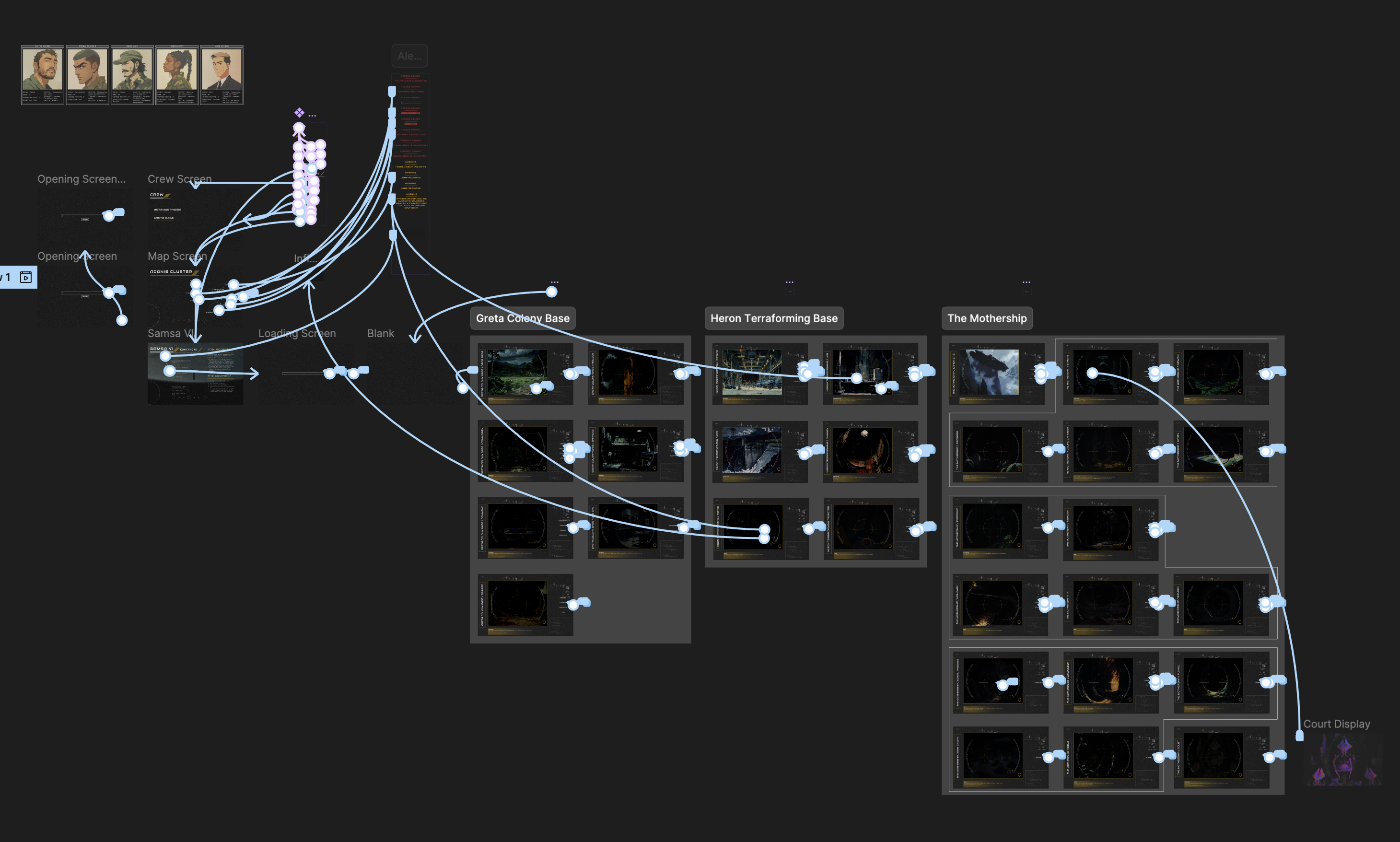
I gave myself just over two weeks to build an MVP. It was bare-bones—essentially a glorified PowerPoint with images for players, plus simple navigation to reference screens for NPCs, objectives, etc. It was… fine. But it allowed me to gather player feedback on what was helpful, fun, distracting, or unnecessary. More importantly, it showed me how to improve the backend experience for the Warden so I could be more responsive to player choices.

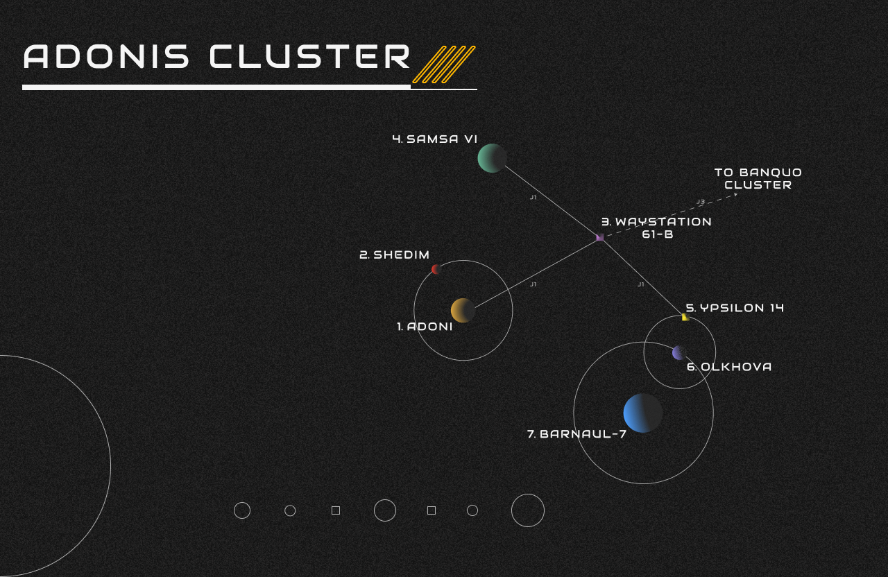
With each iteration, I introduced more dynamic navigation. Agency is key in TRPGs—players need to feel like they can go anywhere and do anything. By adding a location menu, players could make choices, and the UI would seamlessly respond, reinforcing immersion by making their decisions feel impactful.
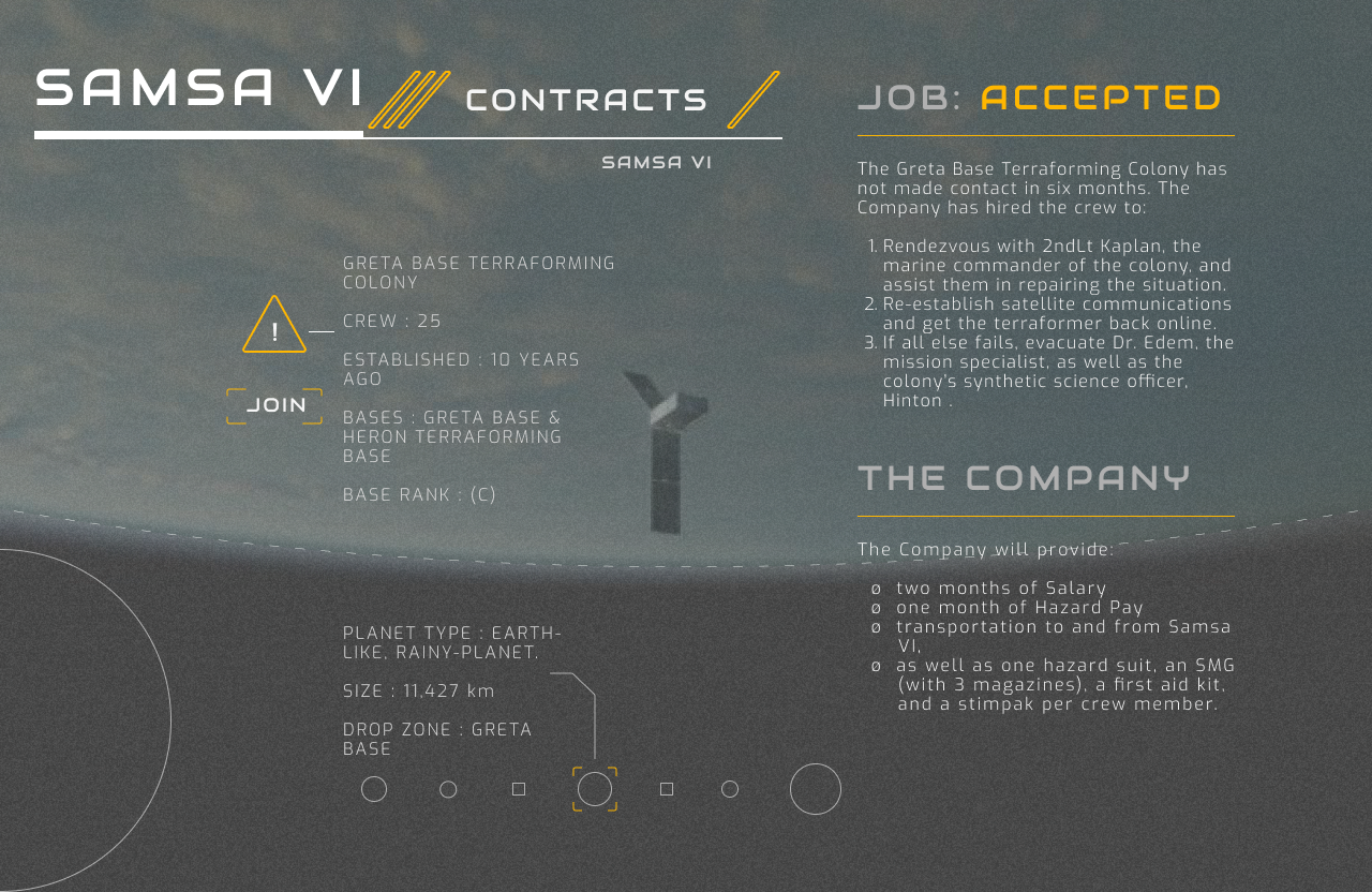
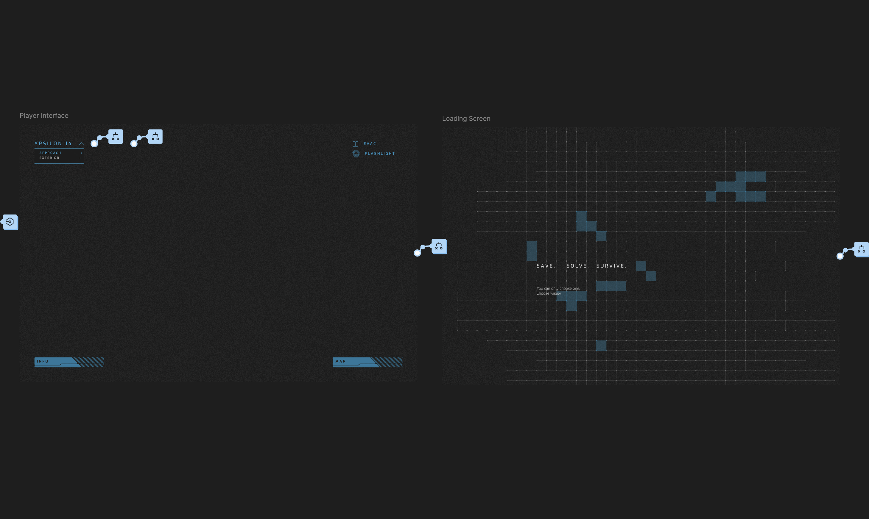
Another major feature was the Rules Carousel. Understanding the rules directly affects a player’s ability to engage, strategize, and have fun. Flipping through a handbook mid-game kills immersion—or worse, makes players hesitate instead of acting on instinct. Inspired by loading screens in video games, I added a chyron that passively cycled through core rules. This way, players absorbed mechanics naturally without needing to pull out the rulebook.
Lessons from Experimentation
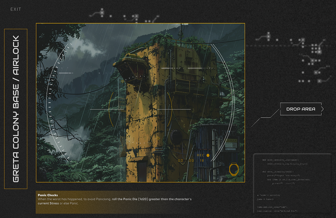
For one iteration, I went hard on the idea of a “video feed” UI, drawing from first-person shooters (FPS). I added a looping VHS-tracking effect, static overlays, animated HUD elements—basically, full sci-fi horror mode. It looked cool. It felt immersive. But it was also a mess.
In playtests, I found myself constantly disabling the VHS animation. The viewfinder UI became noise, blocking useful information without adding real engagement. The biggest lesson? Just because you can, doesn’t mean you should.
At the end of that game, I felt proud of what I had built. Players were deeply engaged. One even asked for the file to run his own game. And that’s when it hit me—I had designed this entirely with the players in mind but had completely neglected the Warden’s experience. When I looked at my design file through fresh eyes, it was a labyrinth. What made perfect sense to me was an unintuitive mess for someone else. If this was going to be usable beyond my own table, I had to rebuild.
The Final Solution
I set myself a challenge: streamline everything. I cut ruthlessly—both in terms of what was on-screen and how the backend was structured. The goal? Make it so simple that anyone with zero Figma experience could hit “Play” and run the game without friction.
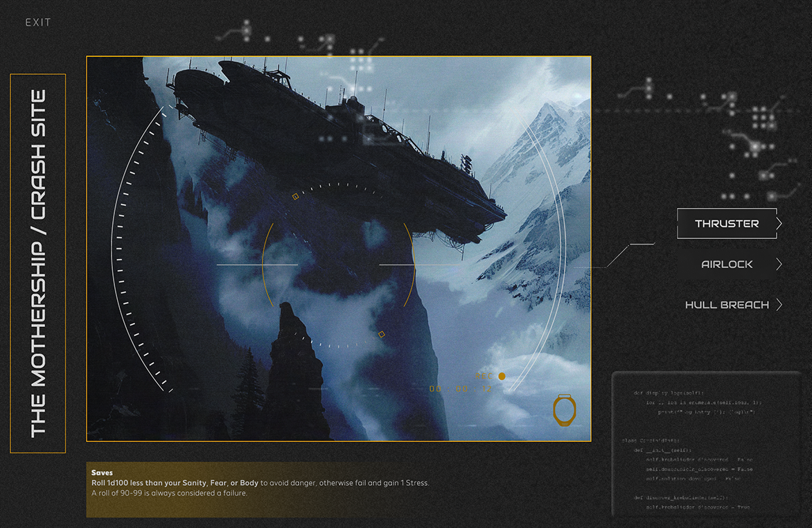
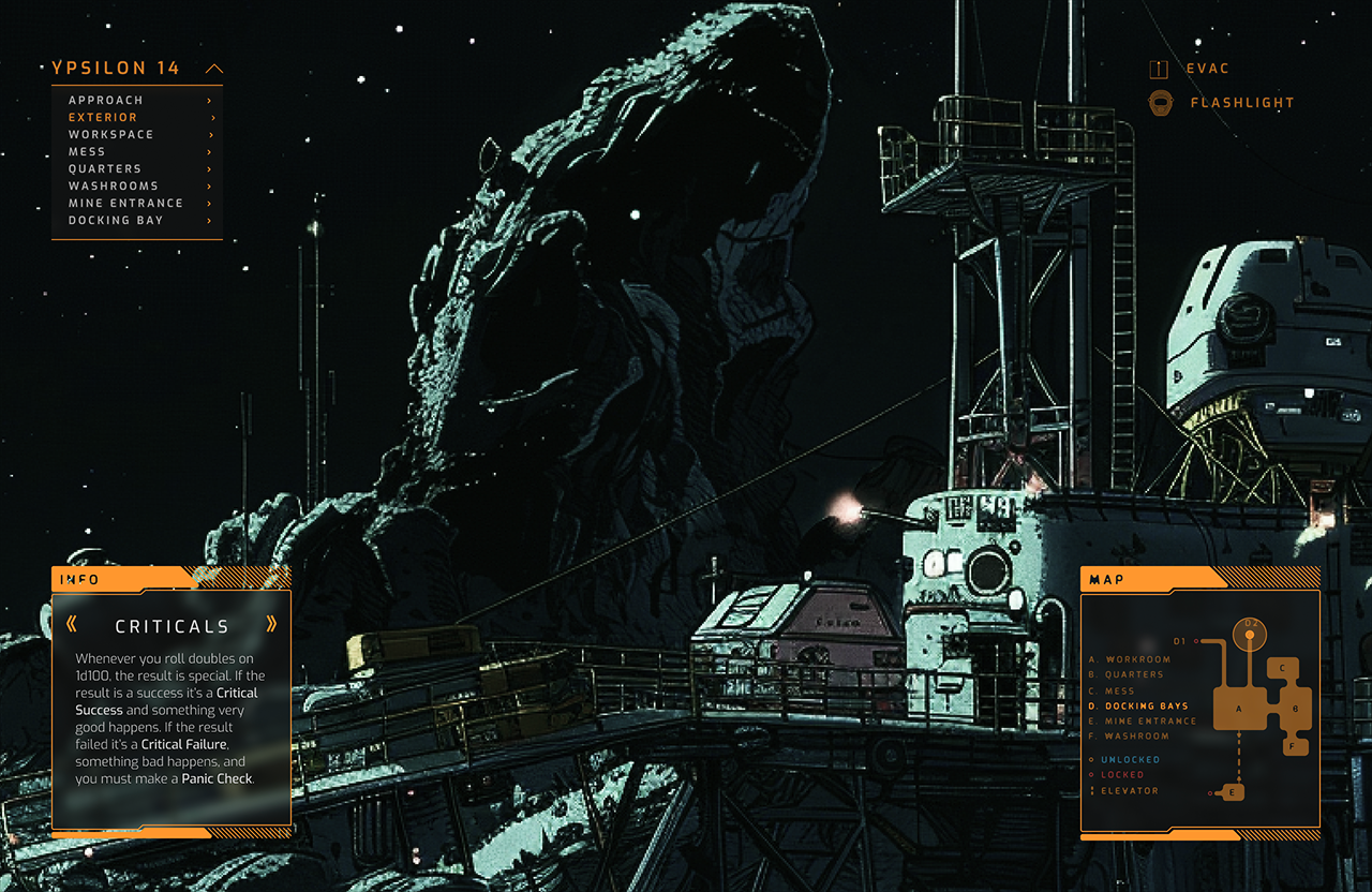
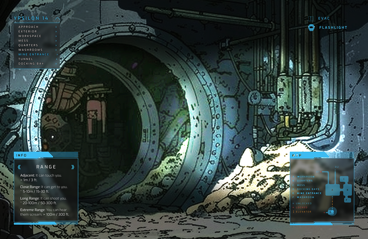
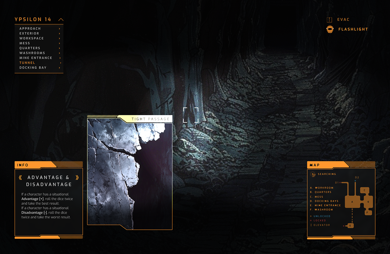
I compressed the main loop into just two main screens: the main location UI and a loading screen.
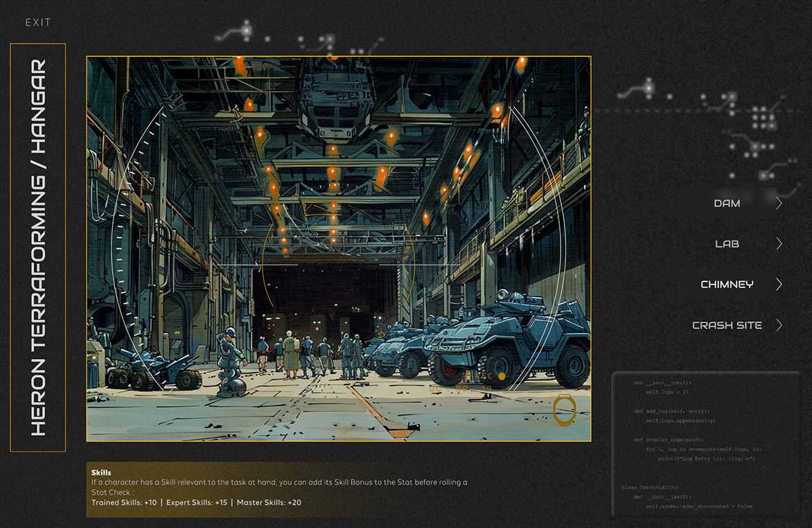
- The location image now takes up the full screen, with controls overlaid like an FPS HUD.
- The Rules Carousel, Map, and Location Menu became collapsible, reducing visual clutter.
- All moving elements were scrapped—too distracting. But I made the screen scrollable so it gave the illusion that the players were looking around.
- Conditional logic powered most transitions, cutting down on unnecessary screens.
- Drawing again from experience with video games, I added a loading screen to smooth transitions, giving the illusion of background processing while actually just making the UI shift less jarring.
This move was a game-changer. By automating transitions and leaning into Figma’s prototyping logic, the Warden could focus on storytelling rather than wrestling with a clunky interface. The UI did its job—supporting the game without stealing focus. Figuring out this sleight-of-hand trick was one of my proudest moments.
Results
Since completing the UI, I’ve tested it with different groups both in-person and online via Discord. Each time, players are initially surprised to have an interactive tool like this at their fingertips. They’re eager to explore—clicking around and engaging with everything on screen, which is exactly what I hoped for. But once the game begins, they settle in, fully immersed. The UI elements act as visual anchors, helping them imagine their characters’ interactions and expand the world beyond what’s displayed.
Reflections
While I’m thrilled with how this project turned out, I see room for growth. Future iterations could refine the Warden UI further, improving its accessibility and expanding features to accommodate more complex scenarios. Additionally, adapting this concept into a standalone tool—rather than a Figma prototype—could open doors to broader adoption. I’m excited to explore how this could evolve into a polished product for the TRPG community.